


Could your UX/UI be hurting your sales?
After reading this, you can finally stop asking yourself – what is the difference between UX and UI?
What if we told you that you could get 9,900% ROI from a single employee?
According to a research report by Forrester, every $1 that is spent on enriching UX yields between $2 and $100 in return, on average.
You may need more than one designer depending on the size of your enterprise, but investing in your brand’s UX/UI is well worth it. Optimizing the consumer experience is not just an investment towards branding, but also an investment towards your long-term business strategy. In fact, leveraging UX/UI design is the best way to gain a competitive advantage that others won’t be able to touch.
User Experience (UX) vs. User Interface (UI)
While User Experience and User Interface are two sides of the same coin, there are a few areas of distinction that should be taken into account.
User Experience
User Experience (UX) is the backbone of whatever you have to offer.
Put simply, it encompasses a consumer’s relationship to a product or service – whether it be physical or digital. In other words, UX refers to the user’s journey from start to finish.
Does your platform speak to your user personas? Are there too many steps for the user to go through before actually reaching the product or service?
UX comes before UI, because it acts as the foundation and prioritizes the technical aspects of design known as product architecture. That’s why many nearshore outsourcing companies place a strong emphasis on UX research and user journey planning from the very beginning of development.
Functionality and usability are the basic metrics used to assess the performance of any UX design.
To optimize UX, designers should begin with consumer research and use case scenarios to understand exactly how a product or service is positioned in its relevant industry. Also consider what channels or pain points may lead consumers to come into contact with the brand.
User Interface
On the other hand, User Interface (UI) refers to the identity of a brand. As the word interface suggests, UI embodies the elements of design that complement UX and will ultimately affect how your product or service is perceived.
UI acts as an intersection between accessibility and marketability.
From color choice to typography size and everything in between, UI takes the decorative elements of UX into consideration.
Has the platform been optimized for all screen sizes? Should a button be positioned differently on the interface?
UI should encourage prolonged interaction through an efficient platform design.
A strong UI is defined by one word – harmony.
A simple and clean design that gets your prospect from A-Z in the easiest, most organic way possible is the end goal.

To compare UX and UI, imagine a car.
UX would serve as the internal components that make the car run, but can’t necessarily be seen from the outside such as the engine, battery, and transmission.
Alternatively, UI would serve as the external shell that may alter someone’s decision to actually invest in the car, such as the size, number of doors, and color.
No one buys a car just because they like the color or the engine runs (unless you are a college student on a budget). In general, the car must fit both the wants and needs of the consumer for a sale to be made.
Similarly, both UX and UI work in unison to further a consumer’s purchasing decision and maintain the client’s loyalty after the point of conversion.
Now that we’ve discussed a few examples, let’s dissect the fundamentals.
Getting started with UX/UI (the basics)
An “optimal” UX/UI design will vary depending on the nature of your brand and whatever it is that you’re hoping to accomplish, but there are a few points that are generally standardized across all industries.
Branding
While it may seem obvious, the fonts, colors, and images that are used to develop your brand’s identity must be aligned.
Your branding should reflect your organization’s values, objectives, and long-term vision.
It’s important to build a design system at the beginning of conceptualization or else you will be forced to waste time fine tuning or worse – risk looking unprofessional.
Elements
Buttons, tables, icons, toggles, loading indicators, search and progress bars, check boxes, tabs…the list goes on and on.
Elements are arguably the most important aspects of UX/UI that tend to get overlooked.
With so many distractions in the modern era, time is more valuable than ever and elements are important to help users manage their time.
Think of how many times you’ve gotten bored of an article or survey that was seemingly endless and ex’ed out of the page.
With a progress bar, users are informed through every step of the process and will appreciate you for taking their sanity into consideration.
Elements embody both UX and UI, because they fall at the intersection of functionality and aesthetic.
Not only do you have to integrate these items into your approach, but you must also make them visually appealing to encourage users to interact with them.
Flows
Flows go hand in hand with elements, because they create fluidity.
Is it easy to move from one thing to another? A UX that lacks flow will leave consumers befuddled.
Whether it’s submitting a form, entering a promotion code, contacting support, or adding something to a cart, flows are logical responses that mirror the user’s thought process.
For example, if someone inputs a discount code, there should be an immediate notification that shows the updated price – or else they might get the impression that there’s an error.
An adequate flow should guide consumers through their journey and assist them in making educated decisions about how to proceed when engaging with your brand.
When organizing a flow, do so according to the hierarchy in which you want users to interact with specific elements.
Pages
Pages form the building blocks of any website so it’s important to optimize them in a way that encourages visitors to take action.
Does your website require a login or sign up? Are you going to list your pricing? Maybe you want to include an FAQ section? What about an error 404 message if the page is unresponsive? Do you have a business phone number on your website so that prospects can easily reach out?
When developing pages, you must consider every possible scenario that visitors could run into.
Indeed, if you don’t already have a company phone number, you should definitely consider getting one to increase conversion on your website (check out Quicktalk to easily get a business phone number and manage incoming calls).
How UX/UI plays a role in sales
Especially in the early stages of development, establishing a strong brand identity is crucial towards gaining momentum, because it serves as a point of differentiation in an oversaturated market.
Too often, companies undermine the value of UX/UI which is typically what leads to an eventual rebranding. Even a small tweak that appears to be irrelevant could serve as the deciding factor for a prospect when it comes down to converting.
If the product you are using has a good UX/UI, you probably won’t even realize it.
In contrast, if a product has a bad UX/UI, you will notice immediately. This is because UX/UI is quite literally designed to enhance your interactions.
As mentioned previously, the more organically this is executed, the fewer obstacles consumers will run into. In turn, they will be satisfied by the efforts that were invested into providing them with the best experience possible.
With that being said, the trick is to make your UX/UI simple and intuitive so consumers aren’t left guessing.
If people aren’t comfortable with their experience while engaging with your brand, they won’t waste their time – especially if you haven’t already established credibility for what you have to offer.
Put the consumers at the forefront of your design process to make a product that appeals to them.
Whether you love using your CRM or hate it, there’s no question that it plays an integral role in the sales process. More often than not, those that dread logging into their CRM everyday struggle with the platforms they are using.
The number of pages, buttons, and features that most CRMs offer can easily become overwhelming, resulting in time lost when users can’t figure out how to navigate efficiently. Close recognized this pain point and developed a CRM that is easy to use with an intuitive UX/UI design at the heart of the platform.
Instead of having to sift through multiple pages to find a piece of information, Close’s user-friendly interface is designed to present users with accessible data at the click of a button.
By appealing to the pain points of sales people, Close successfully positioned their product at the top of the CRM market for those that are seeking a simple, quick, and cost-effective solution for their customer relationship management needs.
Best UX/UI practices
Whether we realize it or not, UX and UI play a major role in shaping our behavior as humans.
Let’s look at a few examples to conceptualize this.
Apple
As an iPhone user, it’s almost impossible for me to consider ever making the switch to Android.
From the sleek, modern interface to the way that the iPhone’s features are supported by an organic design that seems to mirror my thought process, I’ve grown almost too comfortable with the iOS interface.
Unless Apple were to completely shift the UX/UI experience, there is no chance that I would willingly switch to another brand. In fact, I am even willing to pay more for my iPhone to maintain this sense of comfort than save money and adapt to a cheaper, yet foreign interface.
This is a perfect example of how UX and UI encourage brand loyalty even after the point of sale, and I’m sure my fellow iOS comrades can relate.
Apple also adapts its UX and UI by releasing frequent iOS updates that respond to the changing consumer market and technological advancements. The brand’s ability to constantly innovate and improve is another factor that has turned consumers like me into lifelong clients.
This example goes to show that UX and UI should not be a one-time consideration, but rather maintained with continuous evolution to retain customer satisfaction.
UX and UI are deeply integrated with our psychology as consumers.
Whether that’s for the better or worse is a question of philosophy, but there’s no denying that this phenomenon is real.
Think about how many times Instagram has released a feature update. When the notifications panel was moved from the bottom to the top of the screen, there was outrage across the internet.
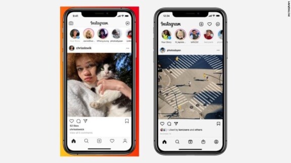
Source: CNN
I can’t begin to count how many times I clicked on the “Shop” icon to check my notifications after the interface switch, which was likely done on purpose to encourage users to enter the marketplace.
Now, we’ve become so accustomed to the new interface that it’s nearly impossible to imagine that it was ever different.
2022 UX/UI trends
While it is crucial to do your own research depending on your niche market, taking some pointers from the most successful companies in the world can give you a head start.
Storytelling: Airbnb
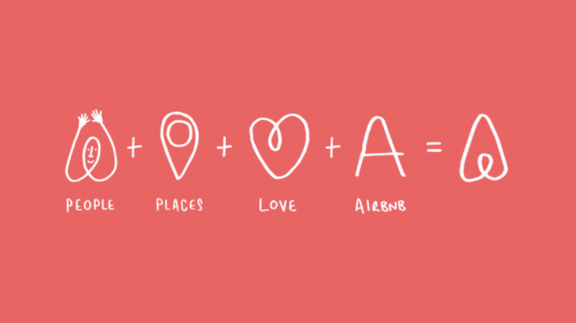
Typically, buying decisions are influenced by a number of factors such as the brand’s values, beliefs, and ideologies – in addition to the product or service itself.
Storytelling yields the perfect opportunity to show your audience what makes you, you.
3D: Leadjet (now Surfe)

Source: Surfe
3D has been popping up everywhere lately.
It’s sleek, modern, engaging, and acts as the perfect blend of realism and fantasy depending on which direction you decide to go with it. The possibilities are nearly endless!
Dark mode: Spotify

Source: Karen Ying
Thanks to the Covid-19 pandemic, people are staring at computer screens for longer periods of time than ever before in history. As a result, many brands are hopping on the dark mode train to reduce the strain that blue light devices are putting on consumers’ eyes.
No matter what your personal preference is, you should definitely consider optimizing your platform for dark mode to ensure that every feature is functional and readable on both black and white screens.
Quick recap
UX/UI Dos
✅ Research your user personas to understand who’s using your platform
✅ Optimize your pages for different browsers and screen sizes
✅ Anticipate the needs (pain points) of your audience and prioritize pages/elements accordingly
✅ Go back and update old content
✅ Check the responsiveness of your platform
✅ Continue to evolve over time
UX/UI Donts
❌ Overcrowd your interface with unnecessary clutter
❌ Rely solely on stock images
❌ Beat around the bush
❌ Allow error 404 pages to persist for extended periods of time
❌ Be too promotional
❌ Be afraid to make necessary changes
Bottom line
Depending on how your company leverages UX and UI, you will inevitably set yourself up for success or failure.
Now that we’ve covered the basics as well as the best practices and latest trends, we encourage you to integrate these rules of thumb into your design approach.
Your consumers will thank you.